Monday, 31 January 2011

Classification And Guidelines


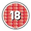
As a group we have decided to classify our horror movie at 18. This decision is based on the British Board of Film Classification's public consultations and Human Rights Act 1998 guidelines.


Which states the BBFC'S concerns, in the areas,
where the material is in breach of the criminal law, or has been created through the commission of a criminal offence
where material or treatment appears to the BBFC to risk harm to individuals or, through their behaviour, to society – for example, any detailed portrayal of violent or dangerous acts, or of illegal drug use, which may cause harm to public health or morals.


The ultimate reason why we have chosen our movie to be strictly viewed by adults, is because of the movie will contain violent behaviour, harm to an individual and dangerous acts, all of which strictly fobidden in any other cateogry and this is also clearly stated in the BBFC's guildline which must be followed for the protection of the public.

This link shows the most recent film classification and the reasons why the films have been put into that category. http://www.bbfc.co.uk/recent/films

Sunday, 30 January 2011

Demonstrating The Use of Technology - Advertising

Now that our teaser trailer is out now, my group and I need to advertise our trailer to get responses from people whether it's positive or negative. The good thing about uploading our trailer onto a website, its the fact that it is uploaded onto a worlwide website. The true feelings towards the trailer will be given, and viewers don't have to feel subjective. They can't see us, so the fear of hurting our feelings is not there. My group and I have began advertising our trailer on social network sites in order to gain feedback. Below are photos shown of times where myself, Nashay or Deborah have promoted our trailer and times where we've got feedback.


In both of these photos, I'd just given the link to everybody on my twitter. A reply came from two people sharing their thoughts on our trailer. Above makes reference to the music we used as it was quite intense and dark. The person said how they were kind of scared and had to turn down the volume in order to decrease the fear they were feeling. 


In this photo the person says how they felt about the trailer. She makes reference to the quality of the video as well, which is quite good considering my group and I had problems in the beginning with the focus of the camera. (LMAO means Laughing My Ass Off) She goes on to compliment our trailer and say that it looked scary, which is what my group and I were going for.

Demonstrating The Use Of Technology - Communication Part 2

Our BlackBerry Messenger chats also helps us as team, remind each other our jobs we need to do in order to improve and strengthen our final product and blogger. As the pings are sent directly and quickly, when we are each at home, we are able to recieve the message and work on whatever area needed to as soon as possible. It is a good form of communication as we are always with our phones, so we can never really miss a message or not be in contact with each other. Below is a chat between us as a group, and Nashay reminding myself and Deborah to upload our drafts.

It also gives each of us a chance to explain ourselves easily, for missing or incomplete tasks that were suppose to be done. The sooner we communicate with each other the quicker we can resolve issues as a group.

Demonstrating The Use Of Technology Through Communication

Due to the growing technology, there are many ways for my group and I to contact each other about our media project. As we all have a BlackBerry, we have the Free BlackBerry Messenger service with our phones, meaning we can chat/ping each at any time and they will get it directly. Its similar to MSN Messenger, except its the service for BlackBerry. This application allows my group and I to discuss elements, decisions and queries quickly and easier. Below are a few chats my group members and I have had relating to our trailer, blogger, poster and magazine front cover. This application allows us to manage our time quickly and makes it more helpful for us. As teenagers are more equipped with technology, our chat history remains on our devices so all we have discussed cannot be forgotten.


In this chat myself and Nashay are discussing the online survey website we used for our audience research. As shown she is asking the login details so that she can upload additional posts to our blog. I later explain to her that I've done the audience research, complied them into a graph and uploaded it onto blogger already; as I wonder what she may need it for.


Friday, 28 January 2011

Demonstrating Knowledge On Web 1.0 & 2.0 In Relation To Advertising

Using Web pages to link people to other users via social networking sites like Facebook and MySpace are popular because they make it easy for users to find each other and keep in touch, essentially through cyber technology.

Web 1.0 websites are non- interactive websites, this means that internet surfers and users are limited to the amount of information that they can add or contribute to the website, whereas Web 2.0 websites is the complete opposite to Web 1.0 websites. Web 2.0 sites allows the users to communicate with one another much more effectively. Users are able to change the website content. Examples of Web 2.0 websites are social networking sites such as, Facebook, Twitter and Youtube.

In addition, to other examples like Web 2.0 which includes web-based communities such as video sharing sites, wikipedia's & blogs. Web 2.0 websites will be the sites that I and my group my be mainly using when marketing (advertising). The reason why we will be using these sites is because we can build a much bigger fan base and it demonstrates a more unison awareness of the twentieth centuries technology bases. Youtube is also cost effective and efficient in sharing of information. Being able to upload our teaser trailer onto Youtube will be beneficial to our group massively in many ways. Youtube can also be accessed world-wide, which enables and embraces the diversity of our multi-cultural society, in relation to participation. Thu, allowing for a broader insight into how well our movie will do in the Cinema.

When we have completed our teaser trailer we will upload it straight onto Youtube, so potential consumers can take a look at our teaser trailer and leave positive or negative criticism. This will also give us instant feedback towards our performance and statistical information how many people will potentially go and watch our movie.


Magazine Name

For myself and group coming up with a magazine name was challenging at some points. We wanted a name that was different and stuck out from others. As we knew we were creating a horror magazine, we wanted our name to represent our genre by showcasing what may be inside our magazine. I originally came up with the name 'Torment' but myself and Nashay felt as though the name was a bit short, so we decided on 'Tormented'. 'Tormented' had a ring to it as well as brought a mysterious and horror image to mind; which is what we were going for. It is not too short and not too long, and defines our magazine genre very well.

We wanted our Masthead to have a bloody effect on it and be memorable to readers so we chose 'Cold Night for Alligators'  and used the norm conventions of a horror; the colour red, to enhance the effect of the blood style of writing. Below is the image myself and group members created for the title.

Group Update - 28th January 2011

I am proud to say that we are on the verge of completing the overal project. We are in the process of completing our teaser trailer, all we are doing now is perfecting our shots for the trailer, inserting text and sound. We have managed to find a horror movie magazine on the Internet to use as our template to form our own horror movie magazine, that is also on the verge of completion.

Tuesday, 11 January 2011

The Process Of Our Final Product: Planning, Research And How We Intend To Use Technolgy

Below is our brainstorming diagram which I produced during the research and planning process. I have presented it in a creative and artistic way because I thought it would be much more appealing to look at and read as opposed to structuring an essay. In addition this brainstorm reflects the groups knowledge and understanding of the use of new and improved technology, mainly focusing on how our group organised, presented, planned and researched various ideas.


Saturday, 8 January 2011

Brainstorming Ideas For Planning - Technologies

Below is a spidergram which I put together in order to briefly point out, how my group and I can show our knowledge and use of technologies when it comes to the planning elements.We decided that showing it visually will be more interesting and entertaining than writing an essay; as visally gives a better stimulation and an understanding to what is going on. We decided that we can upload pictures of some of the posters and magazines we looked at for inspiration. As well as record some of our sessions when we are deliberating and collectively coming up with ideas. As well as upload trailers we looked at and sketches we drew for an idea. We hope that all of these mentioned will be able to show our use of technologies when planning.


Friday, 7 January 2011

Magazine Sketch 3

This last sketch demonstrates another way in which my group and I can have our magazine cover. It is a another busy magazine, which has a lot of features all over. I think this magazine would probably be best suited to my group and I as it gives the readers a sense of variety as to what would be inside our magazine. Once we design it with colours, the magazine will be even more attractive and hard to resist.


I chose to change the layout and a bit and add more features in order, to break some magazine conventions and try something new. I believe that doing something different and unique that nobody has done before may be a great success and come out with a positive. This is magazine also gets straight to the point, by putting everything just out there for all to see; such as the price being right in viewers faces, the page number, the coverline story etc.

Magazine Sketch 2

The second magazine sketch I made is quite busy and scattered. It's one of those magazines that show many storylines and covers on the front cover. I decided to draw a magazine like this as some people are more attracted to magazines that show what will be featured inside rather than the more plain on the outisde and find out inside. There are 9 features placed all around the magazine, attracting readers towards different things such as; competitions, UK Charts, quizzes etc.


Once again the barcode is at the bottom right hand corner and the magazine issue is in the top left hand corner. The magazine website is written underneath the Masthead on the left and on the right is the date of the magazine.

Magazine Sketch 1

This is the first sketch I made of a potential magazine cover for my group. It lists the magazine title at the top, has the date of the issue underneath the title and the price on the right hand side. The photograph takes up the whole of the magazine cover. The photo shows the possessed girl screaming with her mouth wide open and hands up beside her. The coverline story is written just above her belly and the barcode is featured on the bottom right hand corner. I think with the right colours and this layout, this magazine sketch could be a great magazine cover for my group, as it directly gets to the point.


Group Update

I and my group have now been focusing on completing our horror movie poster and magazine. We have technically finished both tasks, all that is left, is to take potential pictures, which will be completed later on this week, because our teaser trailer is targeted at Asian's we have collectively decided as a group to make two movie posters. One of which will be directly targeted at the Asian audience and another targeting a British audience. This will help increase our market base and potentially attract a much larger audience. Which inturn will increase profitablity.
We are very excited and also looking forward to the finishing product of all three tasks.

UK Poster Sketch 3

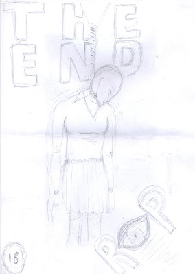
This poster is different to previous sketches I've done before as it shows the glasses which are significant to the movie. There is the possessed girl in the top right hand corner rocking her body with blood all around her, and a table in the centre with the glasses on top, and a dead body with blood underneath. The production name is at the top introducing the film poster. The film title in written in big on the left hand side. The first letter of 'The' and 'End' are written bigger than the words itself. The catchphrase is written underneath the table and at the bottom are the poster credits.


UK Poster Sketch 2

This poster gets straight to the point and doesn't deliver that much detail. The background image is a close up photo of the villan. The production company's name is at the top and is written smaller in order to introduce the magazine and entice them in what the poster has to offer, as well as a lot of the time, people don't really realise or focus on the production company name.


The film title is written quite big and bold with a shadow which enhances the viewer to remember the name. Below the title is the catchprase from the film 'Revenge is sweet, but blood is sweeter'.

UK Poster Sketch 1

Below is the first sketch I created for our UK poster. It showcases a extreme close-up of an eye which is what our storyline is about. It has the production name at the top centre as well as the film name underneath the eye. Blood shears are also flowing down on the picture. Our catchphrase is written at the bottom. I think this would be a good poster because it's direct, it shows a sense of mystery and fear and it's is also quite unique. With the help of Adobe Photoshop and maybe a change of eye pupil, this sketch may be exactly what my group members are looking for.


Asian Poster Sketch 3

This last sketch of the Asian Poster shows the company title 'SCR3AM & OMEGA Productions Presents' In Chinese at the top. While the background photo is of the villian with blood on her hands. On the right would have the film title in Chinese and below would be our famous catchphrase. Once again, this sketch doesn't reveal too much or show a lot.


Asian Poster Sketch 2

Below is the second sketch I've done for the Asian poster my group and I decided on doing. In this photo the film title and catch phrase are below at the bottom right hand corner, while the photo takes up the rest of the page. This shows the victim in pain from the possessed girl attacking her.

Asian Poster Sketch 1

As my group and I decided we wanted to create two posters targeting our Asian audience, below is a sketch of how our asian poster could look. This is the 1st sketch I did, which shows the victim crying and the murderer holding a knife towards the victims face. There'd be 'Revenge is sweet' in Chinese, rotated clockwise 90 degrees. At the bottom right hand corner the film title will be written in Chinese, with a 4 Star review given by a famous company. From what my group and I have researched, Asian posters tend not to have a lot, but only focus on the image with a few writing. So I intended on producing that in my sketches.


Template Trailers

The following clips are of trailers in which my group and I looked at for inspiration. We liked certain aspects each trailer had and we hope to develop it into our own trailer, with a twist.

ORPHAN

RINGU


THE HUMAN CENTIPEDE


Asian Horror Poster Draft

As my group and I decided we wanted our target audience to be Asians, whites and black people we wanted to create two different types of posters. One in Chinese writing and another in English. Below is a draft layout of how we would want our Asian poster to look. I used Photoshop to get a gist of the idea and a translator to find out the language. The black background symbolises where the original photograph would go. At the top it says 'SCR3AM & OMEGA PRODUCTIONS PRESENTS' In Traditional Chinese. On the left hand side towards the bottom centre it says the film title in Traditional Chinese 'The End'. Finally on the bottom right hand corner it says our catch line 'Revenge is sweet but blood is sweeter'. I took the same words we had on our English poster and just translated it onto the Asian poster, with more space for the picture.

From the majority of Asian posters myself and group have studied, they tend not to have a lot of words on the poster but showcase the brutality of the horror in the photo. I think this layout could be a great idea once a picture is added to the background. It shows a great sense of mystery and horror even without the picture, so hopefully our target audience will be intrigued.

Magazine Draft 3

Again there will be a teaser included 'Win free tickets'. Will tell the consumer what horror movies will be on TV.

Magazine Draft 2

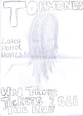
The image will be of our model 'Mandy Lui' who is starring as the villian. The image shows her hair covering her face, this immedatlely connotes mystery and creates an influx of thoughts 'Why her face is not showing'.

This magazine draft shows a teaser, 'win three tickets to see 'The End', this text is ambiguous as the consumer would have to purchase the magazine to see if it is actually three tickets but must pay or totally FREE Tickets.


Magazine Draft 1

Here i have roughly sketched an idea of what our magazine may potentially look like.

At the very top of the magazine, there will be a stip in red text reading, what is on the draft. The image on the front cover will be me, being strangled, however the person strangling me will not be not shown just their hands.

The masthead will be placed at the bottom of the magazine and the magazine will be called 'Tormented' or 'Torment'.

The coverlines will be in relation to our horror movie' The End' helping to promote and create a 'buzz'. Other coverlines will be about other horror movies' the best and worst' etc.


Asian Film Poster- Draft

As I have already pointed out, my group and I have decided to produce both a Asian film poster and a British film poster.

Below is a draft of an idea and how the design may look if we decide to use this sketch and layout. The tagline of ' Revenge Is Sweet' is going upwards on the left hand side of the poster. Whilst the image will be in the centre. Additionally the title of our movie magazine is placed on the bottom right hand corner which reads 'The End' in chinese.

I have decided to keep the design plan ans simple because the research i carried out on Asain movies or movies which target an asian audience reflected that they usually use plain and simple layouts and this intises the audience moreso as opposed to a very fancy design and layout.

Potential Movie Posters, Ideas Behind Design and Style

As a group we agreed to keep our horror movie poster fairly simple. Prior to research we found that simplicity in most cases works in favour for successful horror posters such as 'Orphan' & 'The ring' as shown below.


Having decided that our target audience will be of a ethnic minority and predominatley asian. We focused on the Japanese and Chinese style of horror movie posters. Research reflected that the majority of pictures featured the victim. I paricularly liked posters two and three of below because the victim is gazing into the camera lens, almost as if she is looking to the audience for help this connotes vulnerability and defencelessness.


Finally here are two ideas I had for our potential movie poster. The other two members of the group will upload their draft movie posters at a later stage.