Having decided that our target audience will be of a ethnic minority and predominatley asian. We focused on the Japanese and Chinese style of horror movie posters. Research reflected that the majority of pictures featured the victim. I paricularly liked posters two and three of below because the victim is gazing into the camera lens, almost as if she is looking to the audience for help this connotes vulnerability and defencelessness.
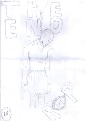
Finally here are two ideas I had for our potential movie poster. The other two members of the group will upload their draft movie posters at a later stage.


No comments:
Post a Comment