Thursday, 17 February 2011

Evaluation Question Four-'How did you use media technologies in the construction, research, planning and evaluation stages?'

Nashay starts. My group and I used media technologies in the construction, research, planning and evaluation stages in an effective and efficient way, and this helped us to produce the final product. In our first lesson as media group we originally began research, our research consisted of watching existing teaser trailers made by media professionals, we were aware as a group that our teaser trailer would not be as of the same standard and quality as we did not have the resources, time and money that professionals have. We spent the lesson watching real professional media teaser trailers on advanced computer technology such as smart boards and Apple Mac Computers. We also watched previous A2 media trailers that our college students produced and also students from outside our college remit in other educational institutions. As a group we analysed each of the trailers that we watched and we looked at them detail, we then broke it down and pointed out what was good and what we would like to include in our teaser trailer. This meant studying the editing techniques, sound and props, on top of understanding the conventions of real media products e.g. trailers. Additionally websites which helped us access Hollywood movie teaser trailers were http://boxofficemojo.com/ and http://www.imdb.com/ these websites showed how much profit the movie made in the box-office, the actors which starred in them and the budget the company set out with. The film the ‘The Human Centipede’ played a major part in inspiring and giving us ideas as to how to make our trailer interesting and creative, the style of the poster was also very creative and eye-catching


Although we studied a variety of movies and movie trailers, ‘The Orphan’ was our main inspiration as you will see from our final product. http://www.youtube.com/watch?v=ku_4tucwzZ4, http://www.youtube.com/watch?v=aD3pyIO2EfI

There are many similarities for example the protagonist character in our horror movie teaser trailer her hair is also in two pony tails to give off a sense of innocence, we chose not to use a lot of blood and gore because we wanted to break the typical conventions of blood, weapons and gore so we decided to put a limit on the amount of blood we used. ‘The Orphan’ used a minimal amount of blood and the movie managed to be bloodcurdling and gross a profit of $6,826,736 (Worldwide).

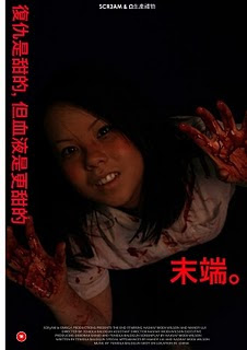
Moreso my group and I had always wanted to push ourselves that one step further – making an Asian poster to target the ethnic minority of Asians and this led us to researching how the Asian film industry works in terms of the style of their horror movie posters and trailers. As a group we gained knowledge and our research reflected how the Asian film industry works- the Asian public liked plain and simplistic designs as opposed to the British public.


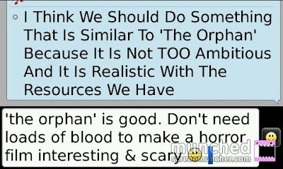
We each decided to further our research knowledge, because we knew that lesson time would not be enough time to complete all three tasks to a high standard. As a result we set our selves tasks to go away read and research in more depth and detail plus feedback to the group via Blackberry messenger which played a big part in our communication as a group. The image below displays this.


My group and I had to distinguish between a theatrical trailer and a teaser trailer once we had established the difference we then had to each analyse a teaser trailer, just to prove that we know exactly what to look for and the purpose of certain shots and the way in which the editor chose to edit a particular shot/s.


We used a variety of technology the internet being our main source of technology to watch make-up tutorials.http://www.youtube.com/watch?v=_ZysEaHiY34, http://makeup.lovetoknow.com/Category:Halloween_Makeup_Techniques Wikipedia and Google also gave us some tips on how to make scabs look real. Below are some of the photographs we took when we were experimenting how to make wound as realistic as possible.


Throughout the process of our coursework the Cannon Camera EOS 450d
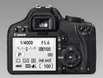
was an important piece of technology if not the most important because we had to take our photographs using it, using the Camera was much more difficult than we thought as we had to get the focus right and the colour settings although we could do this on Photoshop getting it right with the raw image would give us less work to do in the editing process. Furthermore we used a software called Adobe Photoshop, which we were all familiar with because we had all used it prior to our AS course. Adobe Photoshop is graphics editing programme published by Adobe systems incorporated. This software allows you to adjust or remove the colour of your photograph, refine or blur images and also create special effects; Photoshop was very handy when it came to designing our magazine front cover and movie poster. We were able to adjust the brightness of one of our photographs that had Mandy on the magazine front cover. We also used a website to download our fonts into Photoshop http://www.dafont.com/ this website was useful because it gave us some excellent stylised font to reflect the horror genre and mood that we wanted to create with the font both on the movie front cover, magazine and also our teaser trailer.

When editing the group used technology called Final Cut Pro which is only available on Apple Mac computer/ laptops.


Final cut pro made it possible for the group to produce the final product, deleting scenes we no- longer wanted , putting scenes together and adding sound onto our teaser trailer. Final cut Pro was a complex piece of technology during the first stages of editing, until we got the hang of it which took us quite a while, roughly 3-5 days after beginning the project.

For the duration of the stage of pre-production, production and post- production the construction of media technologies involved in research planning and the evaluation processes was the key and most important part in helping and make produce the final product. As a group we enjoyed working together and we are pleased with our final products. Although it was a challenge working in a group, we overcame that challenge and we each went up a steep learning curve. We are hoping that our hard work and effort will reflect in the grade that we are each rewarded with. Nashay Ends


Teniola Starts.Using media technologies was a very important part in the planning stages of creating our product. Throughout the planning stages using technology was an essential part as we needed the practice to develop our skills for the real time when we begin shooting. My group and I needed to be fully aware, trained and up to date with our skills in all aspects of creating our products. http://unsceneproductions.blogspot.com/2011/01/brainstorming-ideas-for-planing.html In the above blog post, posted by myself earlier this year, I explained ways in which my group and I can show how we used media technologies in the planning stages of our product. We decided we wanted to show this visually as it gives a better understanding of what we went through. Looking at this spidergram, my group and I began putting our ideas into practice and uploading template trailers, posters and magazine front covers we looked at for ideas, help and inspiration. http://unsceneproductions.blogspot.com/2011/01/template-trailers.html http://unsceneproductions.blogspot.com/2011/01/as-group-we-agreed-to-keep-our-horror.htmll The link below shows a blog post created by my team member Nashay developing my own blog post with much more detail and specification, explanation and examples. In her blog post she not only develops my earlier post, she goes on to talk about the research stages when using media technologies. http://unsceneproductions.blogspot.com/2011/01/process-of-our-final-product-planning.html

After my group and I came up with a concept for our trailer, and finished looking at other trailers, posters and magazines we decided that we needed to get more practice and into depth with the cameras, so we are fully prepared for when we have to begin filming and taking pictures. My group and I practiced with the cameras by taking location shot pictures which gave us the preparation and ability to familiarise ourselves. We went around our college, with our storyboard and attempted to manipulate that into real form. We looked closely around our college, to see if we could find a location where what we wanted worked well, and could come across or at least represent horror after manipulated with lighting, costume and make-up. My group and I managed to take a lot of photos, in good quality and focus, which we posted to our blogger with text underneath explaining the shots and reasons why we chose there.

At times, in the beginning stages, my group and I found that we wasted less time when we went filming for real as at times our vision we wanted didn’t come out how we wanted when assembling in specific ways (e.g. camera and tripod). There were many occasions were my group and I had a set vision of what we wanted to accomplish during our filming times and then once we set up the equipment with lighting and make-up we realised it didn’t work, meaning we had to change it there on the spot, which meant going back to the storyboard and changing that again. I think this may have happened because although we practiced taking pictures with the camera, we didn’t plan practicing filming with the cameras, so we were kind of new to it and crumbled, as we took it as it came.

We also sometimes found it difficult to assemble the tripod without the help of Adam, as in times where we were rushing, putting equipment together didn’t work, as we weren’t focused on setting up but more of trying to create enough time to get our objective of the day done (taking pictures, filming) achieved as soon as possible. We also found that it took longer to start filming, or to set up without the help of teachers. But towards the end, we were okay as a group. What we didn’t realise was that setting up equipment was an important and huge part of the project and we sometimes forget that it isn’t easy or quick to set them up, it takes time. The time spent setting up equipment, needs to give us enough time to then later film as much as possible, then pack up again. Teniola Ends.

Evaluation Question Three - 'What have you learned from your audience feedback'?

Teniola start. My group and I have received a diverse amount of feedback ranging from positive to negative. We try not to take the negative to heart and not be offended. The anonymous nature of the Internet tends to make people speak their mind without considering people’s feelings. We wanted to be professional, open-minded and objective at all times we receive our feedback. The negative also helps my group move forward and shows us in which way we could improve if we could do this project again.Below shows a various amount of pictures, that explain and show the feedback and response from people towards our products. This first picture, shows Teniola creating the group page, adding the rest of the team members to it, describing the page and our teaser trailer.


The next image shows us uploading and premiering our magazine front cover and UK poster. Both pictures received likes. The magazine cover received three likes and are still counting, whereas our UK poster received six likes. This shows that people preferred our UK poster more than our magazine front cover. This can be understood as our UK poster shows blood, gore and looks very realistic. The genre would easily be recognised from it. Whereas, others may find the magazine front cover may be some what plain as a lot of blood and gore isn't featured, although it does look horrific in ways it may not be seen as out there and extravagant like our UK poster.


The photo below is some feedback my group and I received from our Asian poster. We received five likes and two comments which is a good advantage. The first comment explains how the photo looks as though the female is smiling, which doesn't really resemble a horror movie convention. They also explained how they liked it. This comment is a lesson learned to myself and group members, that when the photo is taken, we need to ensure we capture the right look we are going for. As facial expressions are an important impact on posters, whatever the genre as it helps viewers understand and bring them closer into the film.


As for our UK and Asian movie posters, our targeted audience seemed fascinated, and overall very pleased with our work. When asked their honest opinion one of the audience members replied 'Is that YOUR work? Wow, that's really good.' Another stated that both posters were 'realistic'. Teniola End

Nashay Start Initially we uploaded our teaser trailer onto a website called ‘YouTube’, YouTube is a video sharing website which members can upload and share videos worldwide. Once I had made our Youtube account ‘Scr3am2011’ my group and I uploaded our main product (Teaser Trailer) onto YouTube, and from thereon as a group we started promoting the teaser trailer onto various social networking websites such as Facebook, Twitter and Myspace, this was a cheap and a much more realistic way for a small production company to promote a teaser in order to receive constructive feedback.


As we are a new production company with very small budget this was the cheapest and quickest way to promote our video and make it known to the public and our intended audience.

As a group we had always intended to use social networking sites as our main source of attaining more views, the reason being is because we all already own a Facebook account and two members of the group obtain a twitter account so we decided to use this to our advantage to formulate more feedback, statistics have also revealed that most Facebook and YouTube users are from that of a horror targeted age range 18-25.


This image below shows the statistics of YouTube users.


Many people had noted that they did not understand our teaser trailer until they watched it again, this became commonly known as the images below will illustrate.


Many people thought our teaser trailer trailer was too short and did not include as much detail as they would have wanted to have seen, but what they did not understand was that this was not a theatrical trailer it was in fact a teaser trailer hence the word ‘Teaser’. This led me to explain the reasons regarding why our teaser trailer was short.


All round we received a mixture of negative and positive criticism. A constructive criticism from one member on youtube is illustrated below.

In addition to receiving audience feedback online before the completion of our products, we also gathered feedback after holding a screening of our teaser trailer. One of the members of our audience described the trailer as 'trembling'; whilst another referred to 'really good' using the adjective 'good' four times ! I believe that holding a screening and filming the reactions of the audience simultaneously enabled us to have a record of the audience's GENUINE reaction of the trailer. Having a valid record of their reaction assists us in forming a correct report on their reaction. Although our audience's feedback on the trailer on the whole was positive, they also left ways in which we could have improved our trailer. One of the members of the audience said that we could used less text and allowed the trailer to be more visual, as that was what they expected. The video below is a response from three males who we asked to view our trailer. From this video we learned a variety of things, ranging from positive to negative. All males in this video complimented our trailer by saying it was really good. Gabriel (the second person) said he liked the acting and screams in the trailer, as it really showed some enthusiasm. The last boy, Dayo, said he liked a scene in the trailer a lot. Overall, the positive feedback received from them was appreciated and touching, as we worked very hard. The negative feedback was also very appreciated. The negative feedback ranged from it being quite short and expecting it to be longer, there being more words than images which wasn't expected, the duration of the text being up too short and a better use of sound. Overall, my group and I are going to take this into consideration and use this as a lesson for the next time.


I understood where the person was coming from when they said this and i truly believe if we had more time and resources we could have definitely taken much more time to think about how we would make our trailer cohesive. On the other hand some people did say that the way in which we promoted our trailer was very professional and they would rate our teaser trailer 7/10 as we put a great deal of time and effort into producing all three products set and our extra Asian poster. Other members commented on the music and how it created a sense of mystery and ambiguity, the make-up was very good the drawing on of the uni-brow and we made her look scary.


If we had more time to improve our teaser trailer, we would have made our teaser trailer longer and made it flow much more smoothly with shots in between I also feel that if we had more time we would have made more scabs and wounds and used a larger amount of blood which I feel would have enhanced the standard of our horror movie teaser trailer.


Overall we have learned that in the media industry ‘time is money’, I have also learned that the editing process is a much longer and time consuming process than I could have imagined, and when choosing shots to use there is no right or wrong shot, all shots have the same potential it’s just the way in which you decide to use and edit it in.

We have looked deeply into what the YouTube and Blackberry users have said in their feedback and we have taken on board what they have said as our targeted audience. The constructive criticism has give us an insight on the demand of what the audience want to see included in a horror movie. The feedback has also highlighted some very interesting points that internally we did not notice or seen as a problem during the final stages of production, we appreciate that individuals have taken their time to watch and in some cases leave feedback.

Nashay Ends

Saturday, 5 February 2011

Evaluation Question Two - 'How effective is the combination of your main product and ancillary texts?'

Nashay Start. The combination of our media products and ancillary texts are very much alike, once we started the project my group and I wanted synergy to be the main focus in targeting the potential audience and they would always recognise that our teaser trailer, poster, magazine and webpage are all from the same campaign. The use of synergy has also made real movies successful today such as The Dark Knight and The Matrix.

We also wanted there to be strong continuity throughout most elements of our marketing campaign. We used the same colour scheme (red, grey, black and blue) all sinister colours and our slogan ‘Revenge is Sweet’ is used throughout the advertising process. This all increased our audience awareness of ‘The End’ branding.


During the development and the pre-production process myself and group decided that we were going to, push ourselves one step further than the tasks set and this was to make an Asian horror movie poster we knew that this would broaden our horizon in terms of our target audience, drawing them in and making them feel as if we are targeting each culture personally rather just have one poster for everyone.


On a personal level this move was a very smart decision in making us stand out from all the other potential competitive production companies. The fact that we have two posters targeting at different audience can be classed as our unique selling point, as no other group has decided to be so ambitious besides us. We also feel as a production company we need to stand out and take risks in order to be successful.


When undertaking research I and my group looked at the 2008 superhero movie ‘The Dark Knight’ by Warner Bros Pictures and directed and co-written by Christopher Nolan. We looked at the way in which they advertised their products and we decided to go down the same route, In saying this I mean the use of synergy across the many media platforms such as DVD’s, Toys and Games. The images below exemplify my point.


If we had more time we would have definitely distributed DVD’s and CD’S.


When advertising, marketing and distributing media products there is often a ‘buzz’ created around the movie, this buzz can determine how successful a film will be in the box-office for example again the Dark Knight had a large budget ($185 million) and so they could afford to use techniques of advertising such as cross media convergence, technological convergence and cross-promotions. The Dark Knight grossed just over $1 million.


The company ensured that the film had maximum exposure to film audiences globally, which was a major factor of the company’s success. Technological convergence was used to target the core audience of the film which successfully worked and this is reflected through the Box office figures the Dark Knight made. Had our film been able to use ALL these techniques I feel we would have been much more successful than we have been.


We needed to create a ‘buzz’ around our film and so we knew immediately that we had to expose our film so we uploaded our trailer to YouTube and using advanced technology we were able to spread the link to our teaser trailer through Blackberry messenger, and we also emailed the link http://www.youtube.com/watch?v=ku_4tucwzZ4 to the whole college, to get a deeper insight of how we could improve our teaser trailer had we had longer time to make it. We also wanted know what exactly people liked about our teaser trailer and weather our film would have had potential had we taken the project further.


Uploading our teaser trailer to YouTube was a big step for us as a group as we would have to be open to negative criticism from an international audience.
This made it possible for the audience to distinguish between our movie and other production companies.


The colour scheme of red, black and blue is continuous throughout our campaign. We chose these three colours because of the connotations which are linked to them (Death, Blood, Revenge, Death and Darkness). Throughout our campaign we ensured that our actress was wearing the same costume on both magazine front cover and poster, again so the audience can easily identify our products.


I and my group filmed in and around the college area, the main location being our media room which includes a blue screen, we used the blue screen to our advantage making it appear black because as mentioned before we always wanted our campaign to be predominantly black and red.


Our ancillary text was mainly red the reasons being is, red and black are very popular colours and support the connotations which are associated with these two colours in an horror movie campaign.


The ancillary text and style that my group and I used on all three of our products to symbolise that all the products are from ‘THE END’ brand. The rough jagged edges of the text connote that of a Horror genre.


On all three products we used continuity in the theme of our poster, all our actresses and models were females this again illustrates the idea and concept of identity and our unique selling point as many of the Horror films today include allot more men than female or the man is the protagonist character.


To bring the question to an end my group and I feel that the combination of our main product and ancillary texts was very successful and this certainly benefited our understanding of how the real media world operates. We also feel that the combination of our main product and ancillary text raised our audience awareness immensely.

Nashay Ends.


Teniola Start


The picture above explains visually how effective the combination of our two posters and magazine front cover are. It explains the synergy between the products, and how each can be recognised and know they are advertising the same film. As said before we have the continuous use of red text in each product, which is a main convention of horror films as it represents blood. We also have an emphasis on the female roles shown which is a challenge to normal horror conventions. Also, the low key lighting in the Asian horror poster and the magazine front cover to show a sense of fear among the protagonist female. It represents darkness and the fear felt among her, others will feel. The colour black is also repeated among each product, from text to background. We used this colour repeatedly as it's quite sharp, to the point and states the obvious clearly. The repetition of the synergy is also recognised among our horror teaser trailer as in the shots seen below. From the black background, to the black distinctive text, the red text, the female protagonist and the bloody red text.


Each shot/picture shown represents and distinguishes the same synergy that we've placed on our other three products. What is shown on our Asian poster, UK poster and magazine front cover is what is shown in our horror teaser trailer, so there's no surprises for viewers. From seeing our posters and magazine front cover, I believe that people will see the synergy and realise that each one connect, rather than being confused and seeing no relation between them. I think that my group and I have clearly stated and made it obvious that we are advertising the same film in each product, which is quite effective.

Teniola Ends

Thursday, 3 February 2011

Evaluation Question One - 'In what ways does your media production use, develop or challenge forms and conventions of real media products'?

Deborah starts.In order for our film poster to be considered realistic, it was vital that we followed some of the main conventions used for a film poster. What I have noticed when it comes film posters, is that a tag line for the title is usually visible. For example for the 'My Bloody Valentine' film poster, the tag line is 'Get Your Heart Broken'. Another perfect example of the tag line convention used in film posters is 'Drag Me To Hell' - In comparison to the 'My Bloody Valentine 3D', 'Drag Me To Hell's tag line is slightly longer. It indicates the nature of the story additionally, and allows the audience to be aware of the story line. It says 'Christine Brown has a good job, a great boyfriend, and a bright future. But in three days, she's going to hell'. We, as a group chose to adapt this particular convention into our own piece of work. We used a tag line for our film poster, 'The End'. - Our tag line was 'Revenge is sweet, But blood is sweeter'. Unlike the 'Drag Me To Hell' tag line, We didn't give so much of the story line away. We intended to keep the audience of our film poster in suspense, and according to our feedback, this worked effectively.


Another convention of Horror film posters is low-key lighting. Horror film posters tend to have dark colours and really low lighting. A prime example of where this convention was clearly used is the spanish orientated horror film, 'Rec'. The majority of the background of the poster is black, and the female character in the poster appears to emerge from the black background. She too is not well lit, and one needs to look properly in order to make her out. Contrastingly, we chose to ignore this convention when producing our film poster. Our poster was well lit, with high key lighting. It did not fit the usual conventions of low key lighting in a horror movie. Even though this was so, we still managed to communicate our idea effectively, without confusing our audience. I would also like to add that when it comes to us using high-key lighting instead of low-key lighting, that we did not not 'rebel' against the conventions of lighting, rather we 'challenged the convention', meaning we did not follow the convention of low key lighting, we went against it instead. Deborah ends.


Teniola starts.In terms of our teaser trailer, my group and I have used, developed and challenged the conventions of real media products in many ways. For a start, most horror teaser trailers have low key lighting which enhances the sense of fear, which my group and I have portrayed in our teaser trailer. Although, not all horror teaser trailers have low key lighting, and is shot at night, we wanted to have this in our trailer as it is a common convention and it does bring a sense of terror and fear. We had more than one scene where the filming took place in daylight as we wanted to show a contrast, as well as our camera skills and what we are able to do with light. This shows that, we not only used this convention of teaser trailers we also developed it into a positive for our own benefit. We also, didn’t want our whole trailer to be in low key lighting which is sometimes seen in trailers such as [REC] and Don’t Be Afraid of The Dark (although the low key lighting in ‘Don’t Be Afraid of The Dark’ makes sense due to the title name).
During our trailer we had many quick cuts which is another way in which my media product used a convention of a real media product. This is not only a convention of horror teaser trailers, but teaser trailers in general. Film teaser trailers such as ‘Red’ and ‘Is it just me?’The advantage of having quick cuts in the trailer, is so that viewers only receive a snippet of the movie at a fast pace and be drawn in instantly.

Another common convention in horror movies trailers are victims and/or the killer seen. Our trailer shows a victim and the killer in the trailer, so in a way we used this convention in our own film. But in another way it can also be seen that we developed that convention and challenged it. As usually, in some horror films the only survivor is often female and the killer is mostly a single male (seen in Halloween, Scream and Friday 13th films). But my group and I challenged this convention by having a female as the killer. We only have females in our trailer which isn't a usual convention. This has been challenged by Scream 2 as they also had a female killer. We have a black female actress and an Asian Protagonist which are two races that are often excluded from horror teaser trailers, as mostly Caucasian actors are used.

In most horror teaser trailers there are usually black screens inserted in between, in order to give a sense of fear, as well as to show time in which to take it all in and pause. This demonstrates awareness of the film genre that the film belongs to. Text is another convention that can sometimes be found in horror teaser trailers or teaser trailers in general. Sometimes reading text can sometimes draw in viewers, and make them feel apart of it as it’s from their own voice. In our trailer, we used both aspects; text and black screens. We believe that this was a good feature to our trailer as it shows panic and emphasises the genre. The text we put makes the genre obvious and relates well to our trailer.

Voice-overs and sound are two major conventions that are found within horror teaser trailers. The sound compliments the trailer itself and brings the fear, trembling and feeling within. Whatever sound or voice-over used can affect the way in which the viewers react to the film, whether it’s a horror, comedy or romance. My group and I used the voice-over of a female saying ‘I see you’ slowly and inserted it in the scene where the whiteboard with red blood writing says ‘I see you’. This works well as it feels quite creepy. The sound we used was made by Teniola on an application on an Apple Mac. We used ‘Garage Band’ and created the sound within 10 minutes max and were very proud and happy of the accomplishment once linked to the trailer as it worked well. We used ‘Garage Band’ and created the sound within 10 minutes max and were very proud and happy of the accomplishment once linked to the trailer as it worked well. Also, in horror teaser trailers is most likely that you will see blood somewhere. But my group and I challenged this convention, by not having any blood in our trailer. Although, we didnt't have any blood our trailer still came out scary. We used powder on the killer's face to make her seem pale and gave her a bruise underneath her eye and a unibrow. The victim wasn't seen with any blood at all. Clothing varies depending on the type of trailer and storyline a film has. Within our trailer, the victim was seen wearing a jacket and jeans in the chase scene and the killer was seen wearing a white shirt. Teniola ends.

Nashay Start. When as a group we were creating and designing our magazine front cover there were many conventions that we had to consider, we had to decide weather we would stick to these conventions or break the norm of a real life media product. However collectively we decided to stick to the conventions of real media products as we felt that our magazine would come across professional and of a high quality as opposed to creating the magazine to how we felt the magazine layout should look. Following the general conventions of a horror movie magazine made it simple, easy and efficient to work in a group; this also helped us come to easy decisions, whereas if we did not follow the conventions of a real media product this would create complex ideas maybe resulting in a lack of communication amongst the group.

From the research that we adopted and looking back at our movie magazine textual analysis, which we completed at the beginning of the A2 Course. As a group we were able to notice the similarities between a real movie horror magazine and ours, for example ‘Horror Hound’


the colours that the designer decided use are colours which are associated with horror movies- red is often associated with blood, anger, hatred and revenge and black is often associated with death and funerals. As a group we decided to follow the colour scheme of this particular horror movie magazine. The main colour schemes of HorrorHound are all dark and eerie colours black, grey and red which again connotes a broad platform of connotation from love to death. It also looked interesting and very appealing (Left). Simple dark colours which can connote so many meanings behind picture or what the magazine is about. We decided to follow the layout of a professional real media product as we thought it would make our ,magazine look much more professional and this has clearly reflected through the high quality of our magazine.

The masthead in most horror magazines instantly connotes to the audience what the magazine is about for example the ‘Psycho’ magazine automatically conveys that it maybe about insanity and madness, in relation to ours. Our Horror movie magazine is called ‘Tormented’ which simply represents a wide range of emotions, such as some being provoked, challenged or pushed. Also notice the theme of read in the masthead in the real magazine. More over another convention that we extracted into our movie magazine was the font and the text, as group we felt that our proposed target audience being between the age of 18-25 was young, fresh and interesting and for this reason we used fonts like Arial black bold to show the young, interesting side of our magazine.

Once we were taking the photographs for our magazine front cover, we faced many challenges and inconvenience for example when we initially took the first lot photos they were mistakenly deleted and so we had to retake them at a later date which, pushed the project back. However as a group we overcame this obstacle successfully. Additionally when taking the photographs we had to consider how we would use synergy and cross media convergence to promote and advertise our products in order for our intended audience to easily identify our brand/ production company and media products e.g. poster and magazine front cover. This then led us to the conclusion that we should put the protagonists’ female villain on the magazine front cover, the choice of having a female as our villain breaks the media conventions in itself as real media products usual have a male as the villain.

The costume used a shirt and skirt was simply to signify a school girl which is reflected through the context of our movie trailer and school theme we were aiming for. However in saying this I feel that we could have emphasised/ exaggerated the school theme more than we did for example mise-en-scene in a classroom or have a shot of the schools logo just to simply exaggerate and visibly show the audience in more depth what exactly our movie is about. In conclusion as illustrated above we challenged and developed some real media products such as having females on the front cover and starring in the trailer. However we felt it was more suitable to follow the general media conventions such as colour scheme. Nashay Ends

Teniola starts. In conclusion, my group and I have showed in many aspects of our products where we have challenged, developed and used forms of conventions for horror. I believe as a whole, we have successfully provided what is expected of a horror and even more in areas such as our posters and magazine front cover especially. As shown earlier, with the colours, layout and designs our posters and magazine front cover is up to a high standard in which our audience were expecting and took a liking to very much. In terms of challenging horror conventions or any conventions in general, challenging the forms can be a risk as you're not sure if your audience is going to approve and like the decision you made. With our products, in terms of challenging the forms, I think the risk my group and I took to challenge certain common conventions of horrors was very successful. When we analysis our trailer for example, we broke the conventions of the typical races you expect to see. Having an Asian Antagonist dressed like a typical Yurie brought a sense of fear and emphasised the sense of mystery and supernatural we were going for. Our audience took a massive liking to her character in our poster and magazine front cover as she brought back memories of The Ring, The Grudge etc. As well as having a black female featured in our products, having two races which are usually least likely to be in a horror film, it gave our audiences of those races a sense of peace and happiness that we took it to consideration and chose to feature it. So in each way; challenging, developing and using forms of horror conventions became a great success within our media products, developed and used the conventions of real media products. Teniola ends.

Wednesday, 2 February 2011

Group Update - Tuesday 8th February 2011

As mentioned before, our teaser trailer, movie poster, and movie magazine are all completed to our best ability.

Seeing as we had a Media lesson today,one of our Media teachers was able to look at our movie posters,our movie magazine. Overall, he seemed very pleased with our work, and suggested some ideas, regarding our evaluation questions. He suggested that our answers should be more visual, in comparison to just writing all the time. After hearing advice from Karlos, the group and I took it upon ourselves to hold a 'screening' in a one of the spare Media rooms.

The group and I noticed that one of the reigning themes in our teaser trailer, movie posters and magazine was 'Femininity' and that the male gender was not really highlighted throughout. To correct this, we gathered three males, who were not members of our Media class, and got them to watch our teaser trailer. The point of the screening was to record on tape the genuine reactions of the three males and allow them the opportunity to say what they thought about the trailer overall.

On the whole, the feedback was very positive, and all of the three males appeared to enjoy the trailer - much to the relief of myself and the rest of the group !

We are now in the process of editing our 'screening' video. We intend to post it on to Blogger by the end of this week.

Additionally, we are currently finishing Evaluation Question One, and planning our responses to Evaluation Question Two. - All our Evaluations will be submitted before the deadline.

The group and I are looking forward to seeing our overall grade, and seeing all our hard work pay off.

The Cyle From Development To Exhibition/Exchange

Here I have produced a cycle of how the film industry works. The first stage is development.
Development
This is the stage where ideas are put forward, once our theme and message was established we then started concerntrating on the dramatic structure.

As a new production company we had to consider film genre, target audience, finance and historical success of similar films, in our the film we looked at was 'Orphan'. We then prepared our movie treatment.

Pre-Production

Here we designed and planned. The group visualized what they wanted and I created the storyboard. We then sat down and discussed, our targeted audience we were targeting Asians so we got an Asian friend who is a very good actor to be the main character, alongside with me. As we have a low budget we had to consider the equipment tha was going to be used once this was established. Among the group we chose the roles of the Film Crew, e.g Director who was Teniola, she managed the shooting schedule. I took the role of Producer who created the scenes, i controlled getting the actress (Mandy), marketing and advertising, additionally I was one of the actresses (victim). I thought of the name of the film and tagline. Deborah was the Cinematographer who controlled photography for the film poster and magazine. I and Deborah was also Make-up designer and I was in controll of hair styling ( Mandy's hair in two pony tails). Teniola was also the composer who created the music for our teaser trailer.

Post-Production

Post- production is the process where, editing takes place- Editor (Teniola). We used advanced technology an Apple Mac. We used non- linear editing system Final Cut. As a group we supported Teniola in editing assisting her in what shots to use, shortening scene etc. This was a long and tiring process, however we managed to pulled through and tghe picture was 'Locked' ( No further changes were made to our teaser trailer). After this we had to put sound onto the teaser trailer which was done by recording by Teniola.

Finally we put our trailer onto You-tube to recieve feedback( Which was yesterday), we are now waiting for an ample amount of people to leave critisms and I will upload this via blogger with supporting evidence of a print screen.


Distribution & Advertising

Our film will need to be advertised in order for it to be successfull and potentially profitable and a pack must be put together known as a Package, and this is where our teaser trailer, poster and magazine front cover which will be mainly focusing on our movie, and promoting our horror movie. We will be advertising our trailer, poster and magazine through social websites such as Facebook and Twitter. As well as uploading our trailer onto YouTube to gain more responses and feedback. Web pages will be created listing information and details and pictures of our trailer, poster and magazine front cover.


Exhibition
The final stage is exhibition and exchange. Our horror movie will then be shown in mainstream Cinema's across the world and the ticket sales will be recorded to see how whether the film will be successful or not. Our DVD and Blu-ray disk will be distributed in selected countries, these countries will be, China, Asia, Japan, America, England and Wales. The reason for this is because we have a small budget that we need to abide by, and distributing our product worldwide will be simply unrealistic.
Whereas the Dark Knight could afford to this because they had major financial backing and a huge budget.